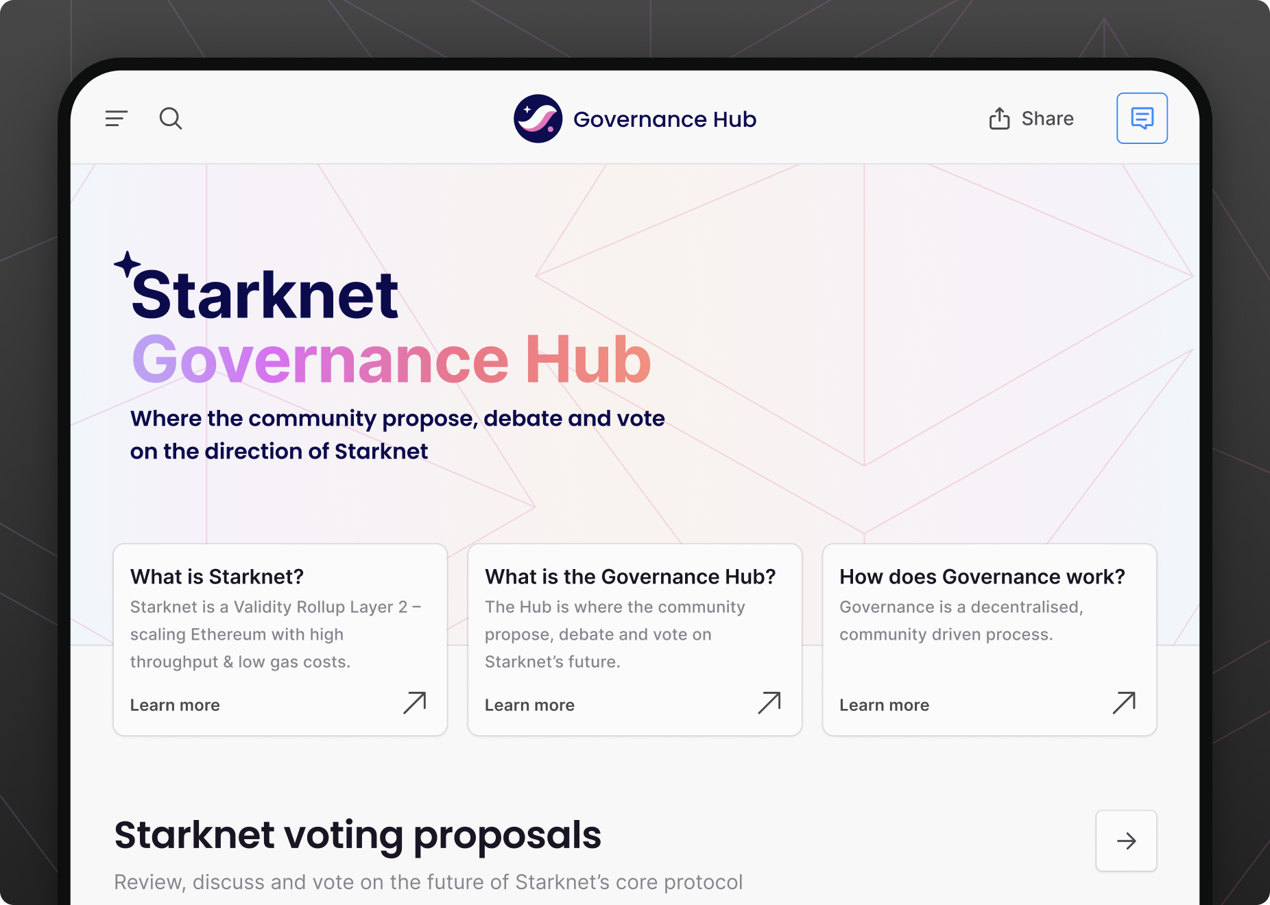
Starknet
A strategic reinvention through community tools, education and brand.
Outcomes
Over a sustained engagement across four interconnected workstreams, I helped Starknet reposition from a technically impressive but largely inaccessible protocol to one with a coherent visual identity, accessible education, demonstrated capability, and practical community tools.
- 500K+
GoL2 generations minted through active community experimentation
- 4
Interconnected workstreams — brand, governance, education, and GoL2
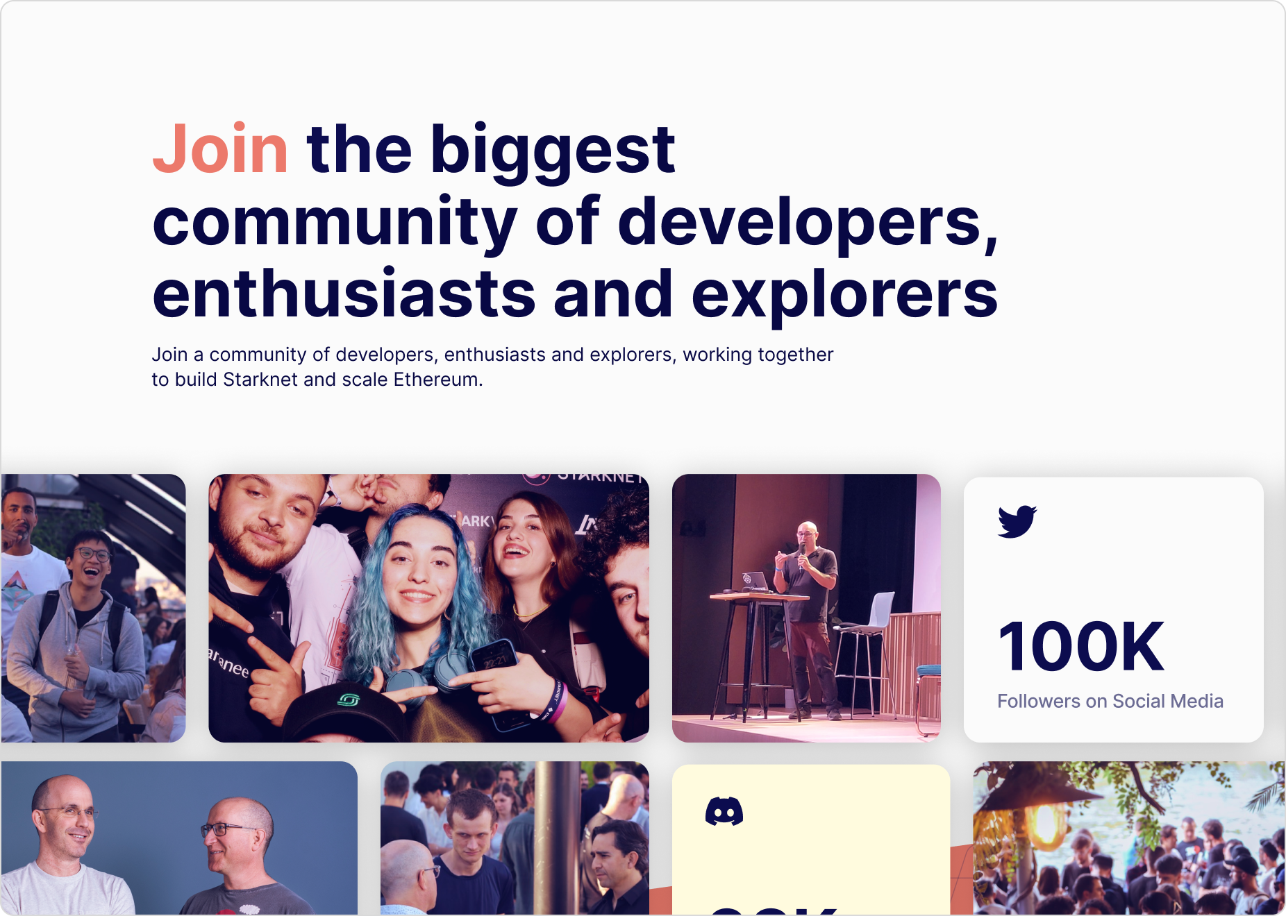
- 100K
Social media followers reached across the Starknet community


“Yuki didn’t just bring design expertise to our project; they brought an in-depth understanding of Ethereum and layer 2. That combination made the work exceptional.”
— Henri Lieutaud, Ecosystem @ Starknet Foundation
The context
Starknet was the first major client after I co-founded Yuki. At the time, the technology was genuinely impressive — a ZK rollup on Ethereum with real scalability advantages — but almost nobody outside of the core developer community understood it. The brand was inconsistent. The main website was hard to navigate. The broader ecosystem had no coherent visual language. And there was meaningful confusion between Starknet and StarkWare, its parent organisation.
The opportunity here wasn’t just to make things look better. It was to help Starknet reposition entirely: to become not just a technically credible chain, but an approachable, community-driven one with a clear identity and genuine tools for participation.
That meant approaching the work as a connected programme rather than a series of one-off deliverables.
The strategy
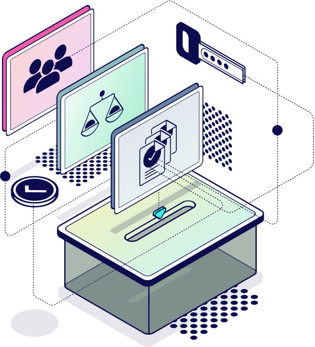
I structured the Starknet engagement around four workstreams, each addressing a different dimension of the same positioning problem:
| Workstream | What it solved |
|---|---|
| Brand & website | Visual coherence, audience clarity, community infrastructure |
| Governance app | Practical tools for community participation in network decisions |
| Educational content | Technical accessibility for non-specialist audiences |
| GoL2 | Concrete demonstration of the network’s computational capability |
None of these worked in isolation. The brand gave the education content visual credibility. The game gave people a way to experience the network’s capabilities directly, before they fully understood them. The governance app gave an engaged community somewhere meaningful to go. Each workstream strengthened the others.
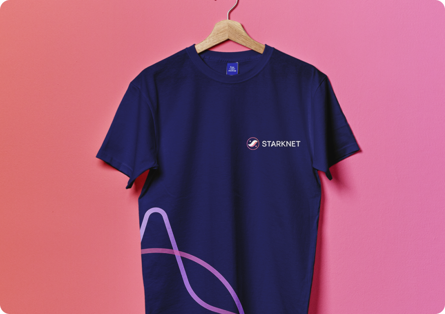
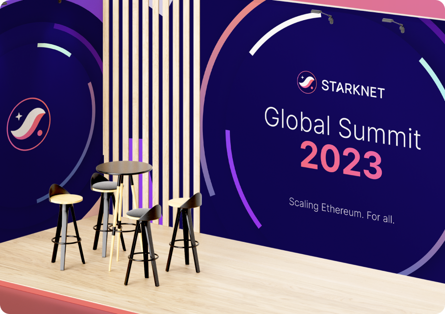
Brand and website
The existing brand had recognition but lacked depth. It didn’t clearly separate Starknet from StarkWare, and it didn’t have the kind of visual system that could hold up across product UI, events, documentation, and physical materials simultaneously.
The brief was to keep the core logo mark but fix what wasn’t working, and build a full visual system around it that teams could actually use.
I retained the mark but refined it carefully, adjusting proportions, spacing, colour balance, and the typographic pairing. Changes that seem subtle on paper but make a real difference in how a logo reproduces at small sizes or sits on a conference banner. From there I built a complete visual language: colour rules, typography, layout structure, motion guidance, iconography, illustration style, and photography direction. Not a style guide, but a working system.
A key priority was creating clear visual separation between Starknet and StarkWare. That meant defined rules around colour, composition, and graphic language so the two organisations could coexist without constantly being confused for each other.
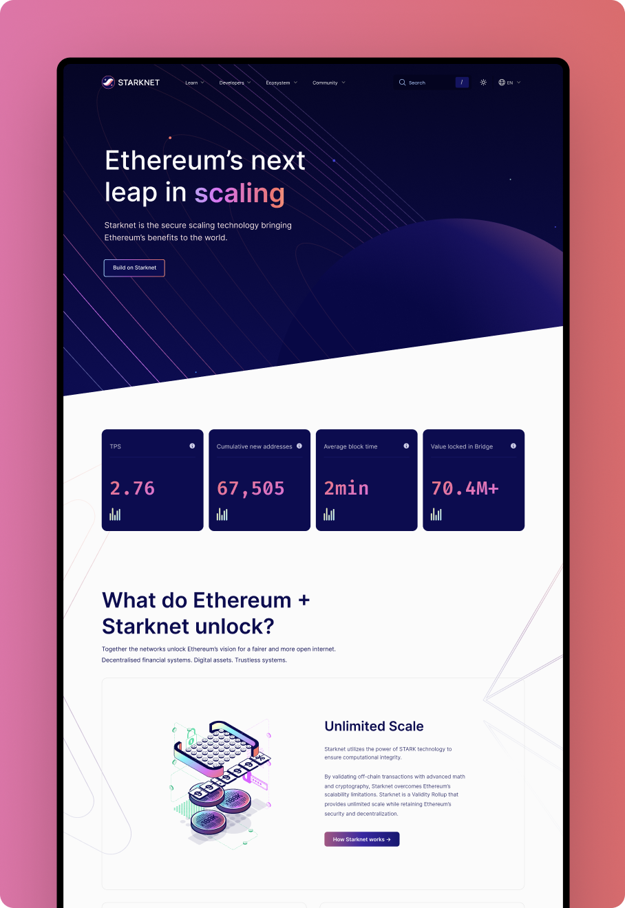
Alongside the brand, I redesigned the Starknet website with a strong focus on information architecture. The previous site made it difficult for visitors to understand where to start or how to go deeper. I restructured navigation and content hierarchy around three distinct audiences: developers, ecosystem participants, and general learners, so each had a clear path through the content.
Because Starknet is a community-driven network, the site was built as an open source project with multilingual translation enabled through community tooling. That wasn’t cosmetic. It aligned the platform with how the network itself was meant to operate.
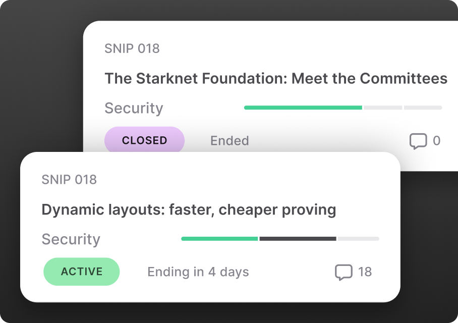
Governance
The next workstream was a governance web app designed to make community participation in network decisions realistic, not just technically possible.
The problem with most governance tools is that they assume prior knowledge. That tends to concentrate decision-making among a small number of engaged power users while the broader community watches from the sidelines. Governance that works for a handful of insiders isn’t really decentralised governance. The goal here was different.
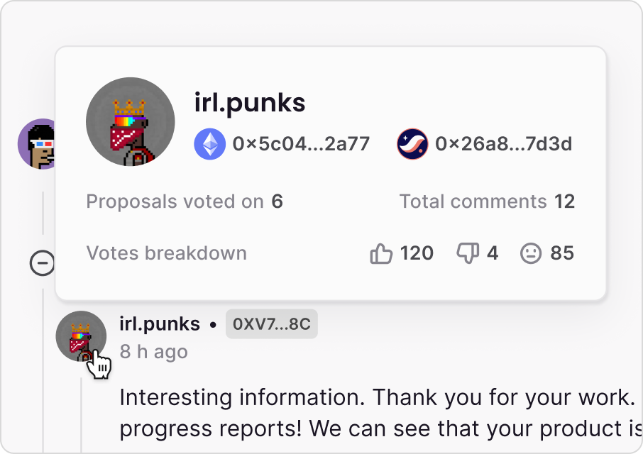
Delegation deserved particular attention. It’s essential for governance systems to scale without burning people out, but it’s often poorly understood and poorly executed. I designed delegate profiles to make behaviour transparent: voting history, participation patterns, areas of focus. Users could make informed choices about who should vote on their behalf rather than guessing.
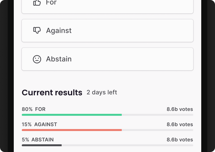
I designed the app around the full proposal lifecycle: creation, discussion, and voting, with Snapshot integrated so the experience felt unified rather than patchworked. Proposals and status were presented clearly, with the important signals visible at a glance and deeper detail available when needed. Once proposals passed, they continued as visible initiatives so the community could track progress beyond the vote itself.
Education was built in from the start. Plain language guidance on how governance worked, how delegation operated, and what different proposal types meant was part of the product, not a separate documentation page.
Mobile was the primary use context. Most users would review proposals and cast votes on their phones, in short sessions. Cognitive load, layout, and interaction priority were all designed around that assumption.

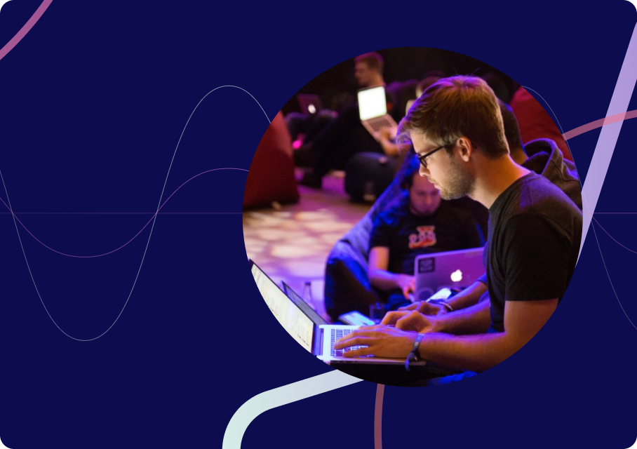
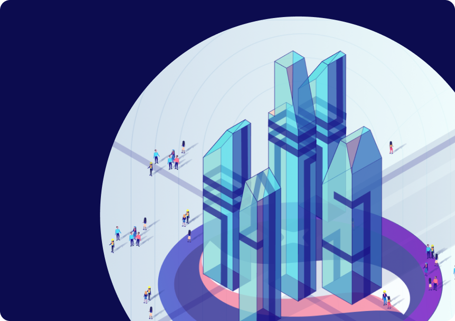
Education
One of the more technically demanding projects I’ve worked on.
The brief was an animated video series explaining Starknet’s core technology — STARK-based rollups, zero-knowledge proofs, Layer 2 architecture — to an audience ranging from complete non-specialists to developers who already understood the space. That’s a genuinely narrow path to walk, and plenty of technical education content falls off one side or the other.
My approach was to understand the technology properly first, then rebuild the explanation from scratch in plain language. Not simplified to the point of inaccuracy, but stripped of unnecessary friction.
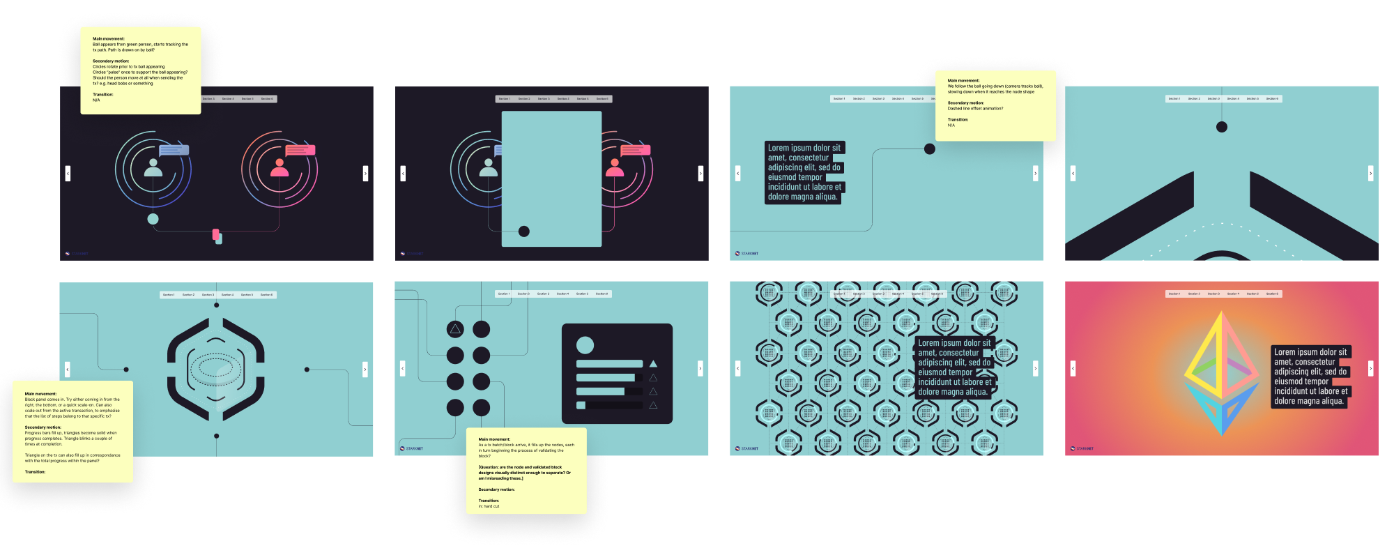
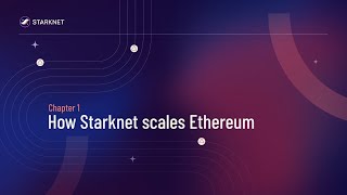
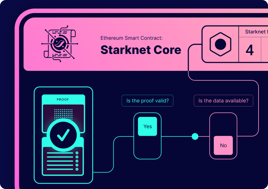
How Starknet Scales Ethereum
The Starknet Sequencer
The Starknet Prover
Secure Settlement on Ethereum
I ran working sessions with Starknet’s education and engineering contributors where I’d restate concepts back to them in simple terms and let them correct me. That process exposed the hidden assumptions and shorthand that accumulate inside any technical team. When an idea could survive being explained simply without losing accuracy, it was ready to storyboard. Not before.
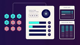
The content was structured as a chapter series moving from overview to detail. The first chapter established the scalability problem and the high-level flow through Layer 2. Each subsequent chapter narrowed focus to a specific component — sequencers, provers, validation — with enough context from the previous chapter to give it meaning.
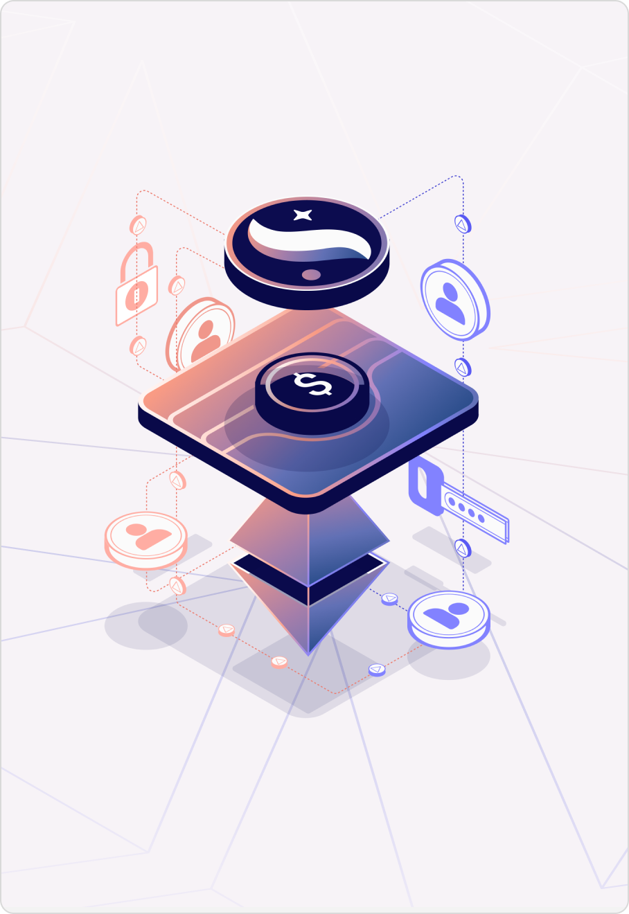
Visually, I built the system around simple geometric forms. That matched the mathematical nature of the subject and allowed for two consistent visual perspectives: an isometric real-world view showing network actors and flows, and a zoomed internal view showing what was happening inside nodes and proofs.
Assets were designed as a reusable kit rather than one-off scenes. Starknet could extend the series later without starting from zero.
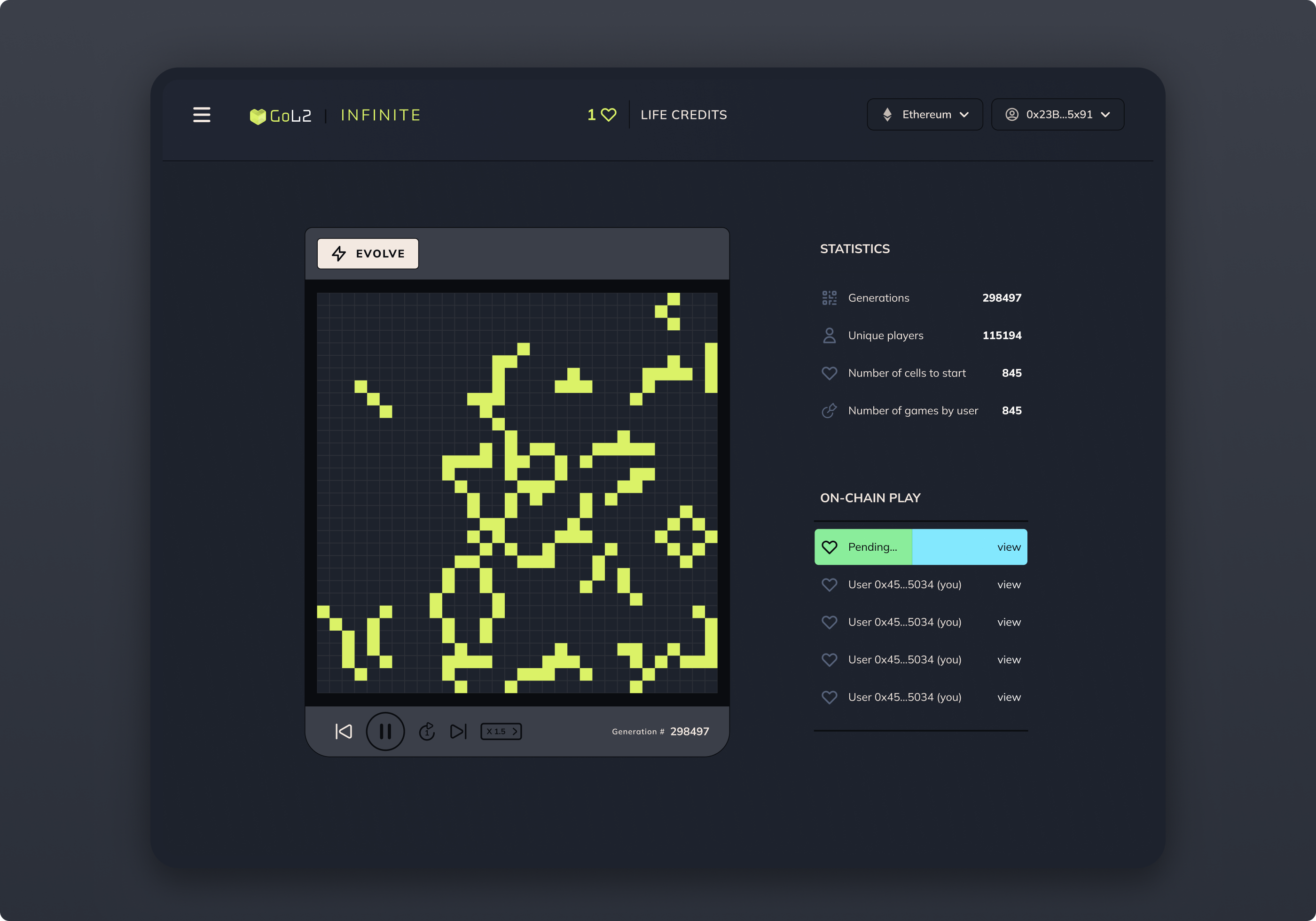
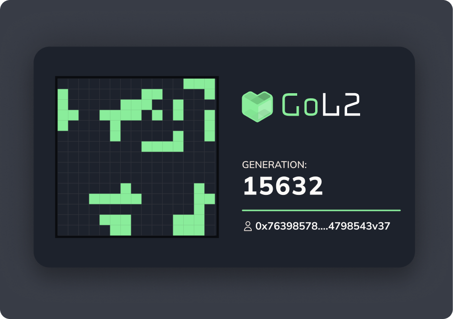
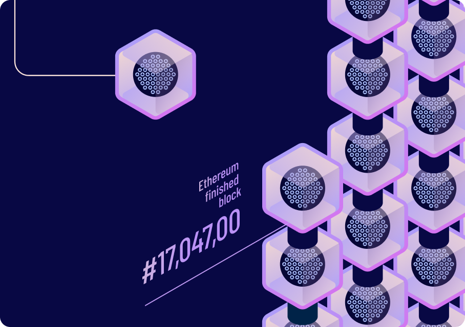
GoL2
GoL2 generations minted through active community experimentation
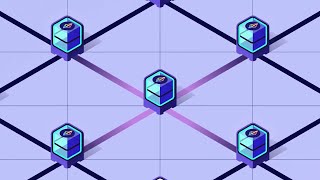
A game built on Starknet, inspired by John Conway’s Game of Life.
The brief was to demonstrate that Starknet could support computationally intensive applications — the kind that would be impractical on Ethereum Layer 1 alone. I could have built a benchmark demo. Instead I reached for something with history and character.
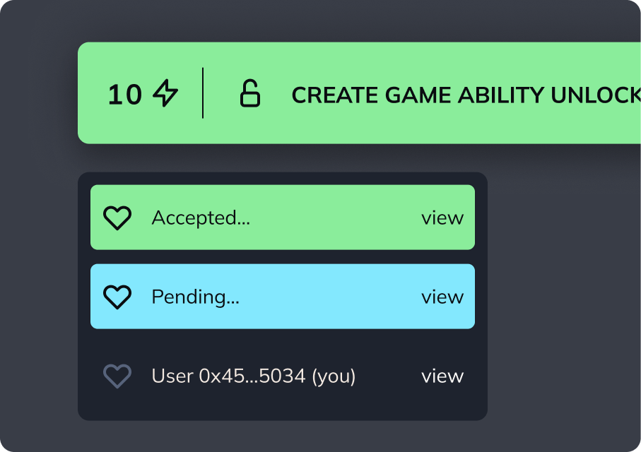
Conway’s Game of Life is a cellular automaton from 1970. Simple rules produce surprisingly complex behaviour across a grid over successive generations. Each generation depends entirely on the previous one, and must be computed correctly. Running that evolution logic fully on-chain — not simulated off-chain and posted later — was the entire point. It provided a clean, verifiable demonstration that couldn’t be faked.
I designed GoL2 so users could do more than watch patterns evolve. They could influence generations, build their own starting configurations, and run simulations forward. Creator tools let people design and share their own boards. That shifted the experience from passive observation to active experimentation.
The visual direction drew from flat geometric computer and arcade aesthetics of the 1970s and 80s — a deliberate reference to the computational history GoL2 was building on, and a natural fit for a grid-based cellular system. Sharp contrast, simple shapes, minimal decoration. The state of the board was always the hero.
More than 500,000 generations were minted through gameplay. Users could also mint NFTs capturing specific states they’d evolved, turning the simulation into a generative artifact engine as well as a technical proof of concept.
The sum of the parts
Looking at these four workstreams together, they achieved something that no single project could have done on its own.
The brand gave Starknet a coherent visual presence it could apply consistently across the ecosystem. The governance app gave the community practical tools to shape how the network evolved. The education series made the technology accessible to people who had previously been locked out by jargon. GoL2 made the network’s capabilities concrete and experiential — something to participate in, not just read about.
That combination — coherent identity, practical participation tools, accessible understanding, and demonstrated capability — is what a real ecosystem reinvention looks like. It’s not a rebrand. It’s a connected strategy executed across multiple touchpoints over time, each piece making the others more credible.