HubSpot Support
From internal tool to product line
Outcomes
A customer support platform built from scratch for HubSpot's internal customer service organisation that grew into Service Hub — now used by 250,000+ organisations worldwide. Since launch, HubSpot has exceeded $2.6B in annual revenue (up ~21% year on year) with Service Hub becoming a core driver of multi-hub adoption.
- 57%
Increase in ticket close rates within 6 months of internal launch
- 39%
Faster ticket handling across the support organisation
- 72%
Service leaders reporting CLV gains after adopting Service Hub
My role
| Scope | 0 to 1 internal tooling project that evolved into a commercial product line |
| Team | Solo designer, embedded directly with the Dublin customer support organisation |
| What I owned | Full UX strategy and execution across the entire project: how the product suite should be structured to make support teams more productive and better serve customers; all research, IA, interaction design, prototyping and testing; and as the tool became a product, the UX direction for the expanded suite including knowledge base, CSAT and NPS feedback tooling, and customer health features |
Where it started
When I joined HubSpot I was assigned to the team responsible for the tooling used by the internal customer service organisation. At the time this was not a single product. It was a collection of third-party apps stitched together with scripts and one-off integrations. It mostly worked, because the people using it were very good at their jobs. But as the business scaled, the cracks were getting harder to ignore.
HubSpot had built a strong reputation for high-quality support, and getting customers up to speed post-onboarding was critical to retention. The tooling was not keeping pace. It wasted time, obscured customer context, and made consistency across regions and channels difficult to maintain. We needed something built for how support actually worked, and that could grow with the business.
None of what followed was obvious at the outset. The eventual product, Service Hub, wasn’t planned. It came from solving a real operational problem, doing it well, and watching demand follow.
Discovery and research
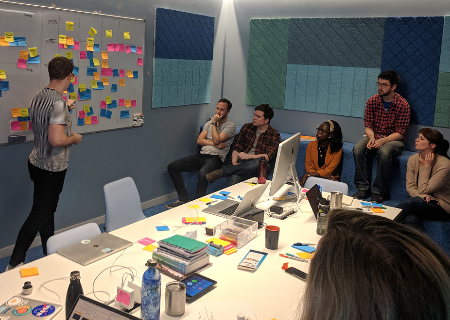
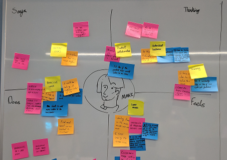
I was co-located with the Dublin/EMEA support team, which gave me direct access to observe real workflows in real time. I ran contextual inquiries, shadowed agents during active shifts, hosted workshops, and conducted remote interviews with teams across North America and APAC.
Three principles shaped my approach:
- Understand actual behaviour, not what people say they do
- Validate early and often. Rough sketches, not polished presentations
- Define success in terms of real actions: speed, fewer errors, less switching. Not feature checklists
Key findings
| Finding | What I learned |
|---|---|
| Fragmented tooling | Reps switched between multiple systems constantly. Timezone handovers were especially disruptive: slow starts, lost context, frustration on both sides |
| No prioritisation signal | Reps had no clear guide for what to work on next, creating imbalance and wasted decision time |
| Dynamic work patterns | How reps worked changed significantly throughout the day. Volume-heavy in the morning, more complex problem-solving later, wind-down toward the end of a shift |
| Customer variability | Technical users wanted direct answers; less experienced users needed broader guidance. Reps had no quick way to read which they were dealing with |
| Manager blind spots | Managers lacked real-time visibility into workloads, SLA status, and early warning signs |
| Lost customer threads | Customers regularly missed replies or couldn’t locate past conversations when they needed them |
| Siloed knowledge | Critical information stayed with individuals rather than flowing across the team |

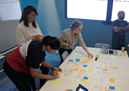
Once confident in the findings, I moved quickly into prototyping. Rough sketches first, enough fidelity to test a concept and get a genuine reaction. Then simple wireframe prototypes, iterated through several rounds with reps, managers, and customers. Keeping things lightweight meant I could incorporate feedback without sunk cost.
The unified system
Rather than improve the existing patchwork of tools, I replaced it with a single coherent system built around how support actually ran.
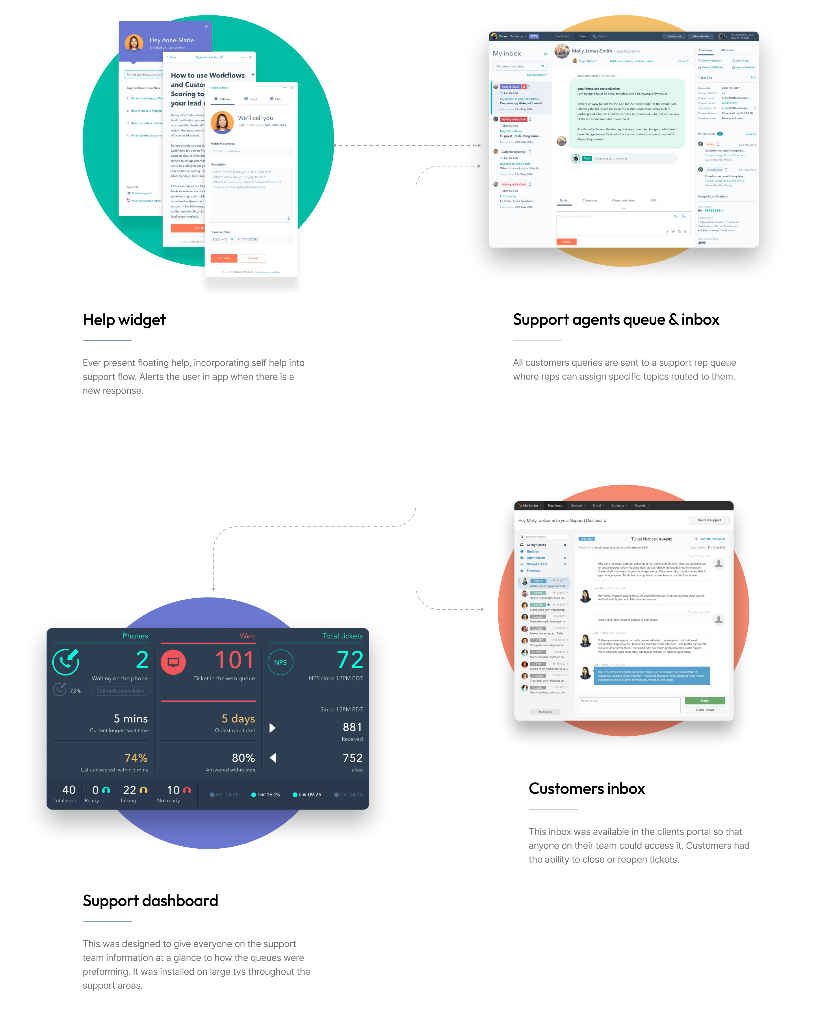
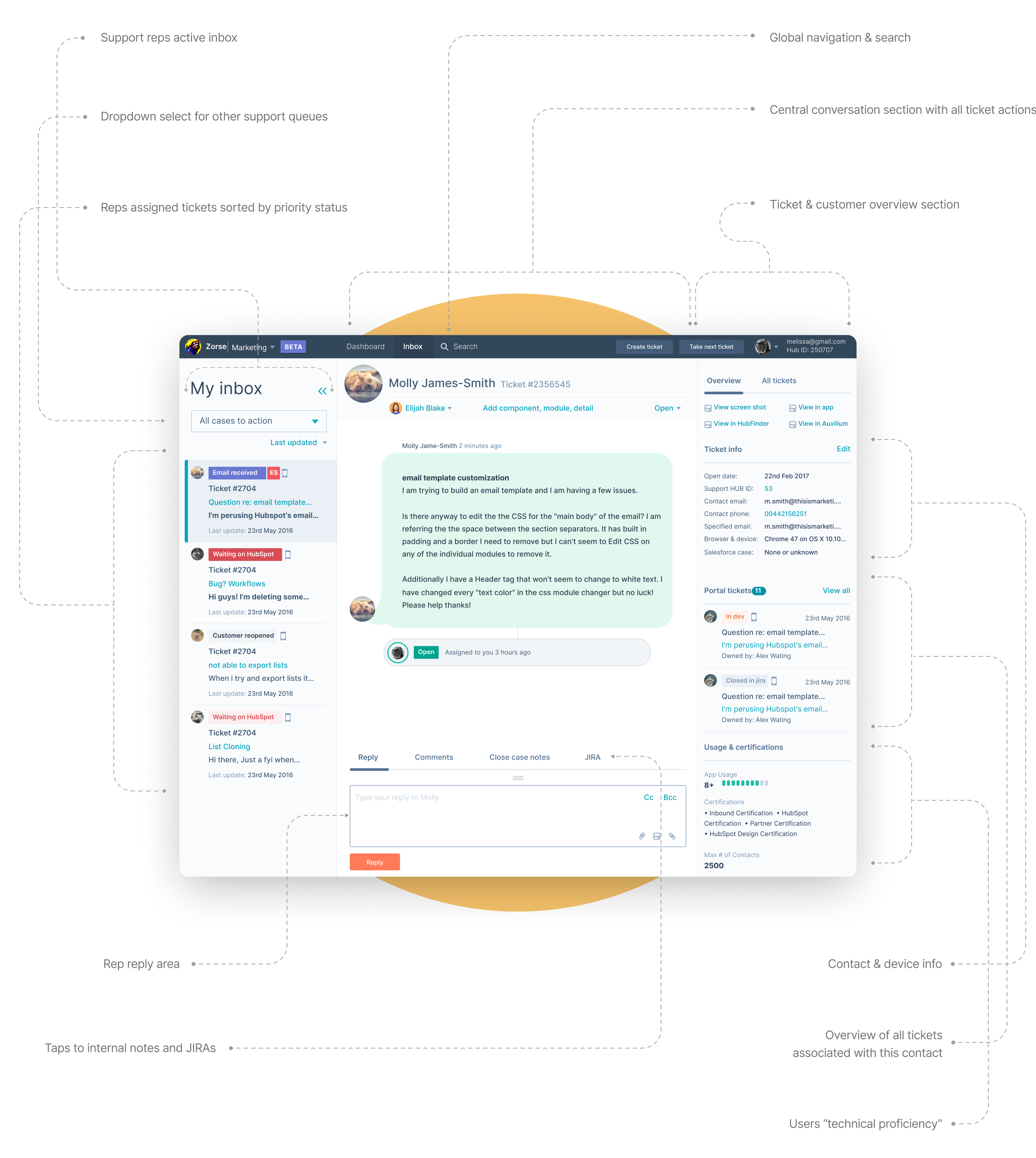
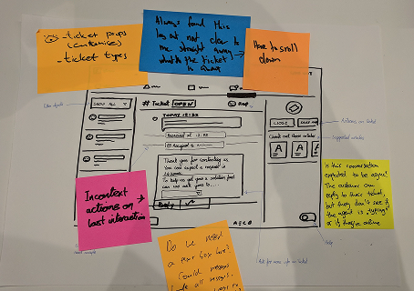
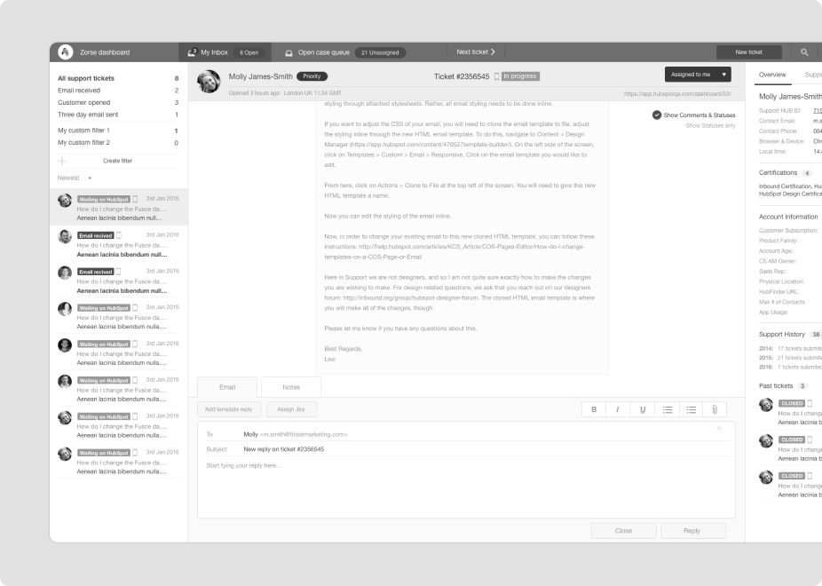
The support inbox
The core operational tool. I pulled all the relevant customer context into a single view: account age, ticket history, product usage, and previous rep notes. Reps could assess who they were talking with quickly and adjust their approach accordingly, rather than hunting across tabs to piece together a picture.
The workflow was deliberately kept flexible. Reps don’t work the same way all day. The system needed to support that range, not force everyone into a single pattern.
”Take next ticket”
One of the more consequential design decisions I made was introducing a Take next ticket button inside the rep inbox. It sounds like a small thing. It wasn’t.
The problem was the queue. All incoming tickets landed in a shared pool. Reps would open tickets one by one, read them, and decide whether to assign them to themselves. Two problems emerged consistently from this.
First, multiple reps often viewed the same ticket simultaneously without knowing it. This created wasted time and occasionally duplicate work: two people reading and partially preparing a response to the same customer. Second, reps were spending meaningful decision time inside the queue rather than resolution time inside their inbox. Reading a ticket to decide whether to take it is friction. Doing it twenty times a day adds up.
For reps who didn’t want to manage that overhead, I added a single button in their personal inbox. One click pulled the next appropriate ticket from the queue and assigned it directly to them. No hunting, no interference, no deliberation. Reps who wanted more control could still access the queue, but now there was a faster path for high-volume periods.
Reps using the button processed more tickets per shift and reported significantly less decision fatigue. The change was small in implementation and measurable in output.
Keeping both views
After “Take next ticket” shipped, there was interest from support leadership in removing the shared queue view entirely and limiting reps to their personal inbox. The logic was reasonable: simplify the interface, reduce confusion, narrow the focus.
I pushed back. The research didn’t support it.
Reps don’t work in isolation, and the way a support shift actually runs depends on being able to read the broader picture. In the morning, experienced reps clear overnight handovers from other timezones before the day gets busy. Across the day they manage a mix. But close to the end of a shift, they stop picking up complex cases. Not because they’re avoiding work, but because a complex case requiring a handover is bad for the customer and inefficient for the team.
Removing queue access would have simplified the interface on paper and made support worse in practice. I kept both views, trusted reps to manage their own day, and the research turned out to be right.
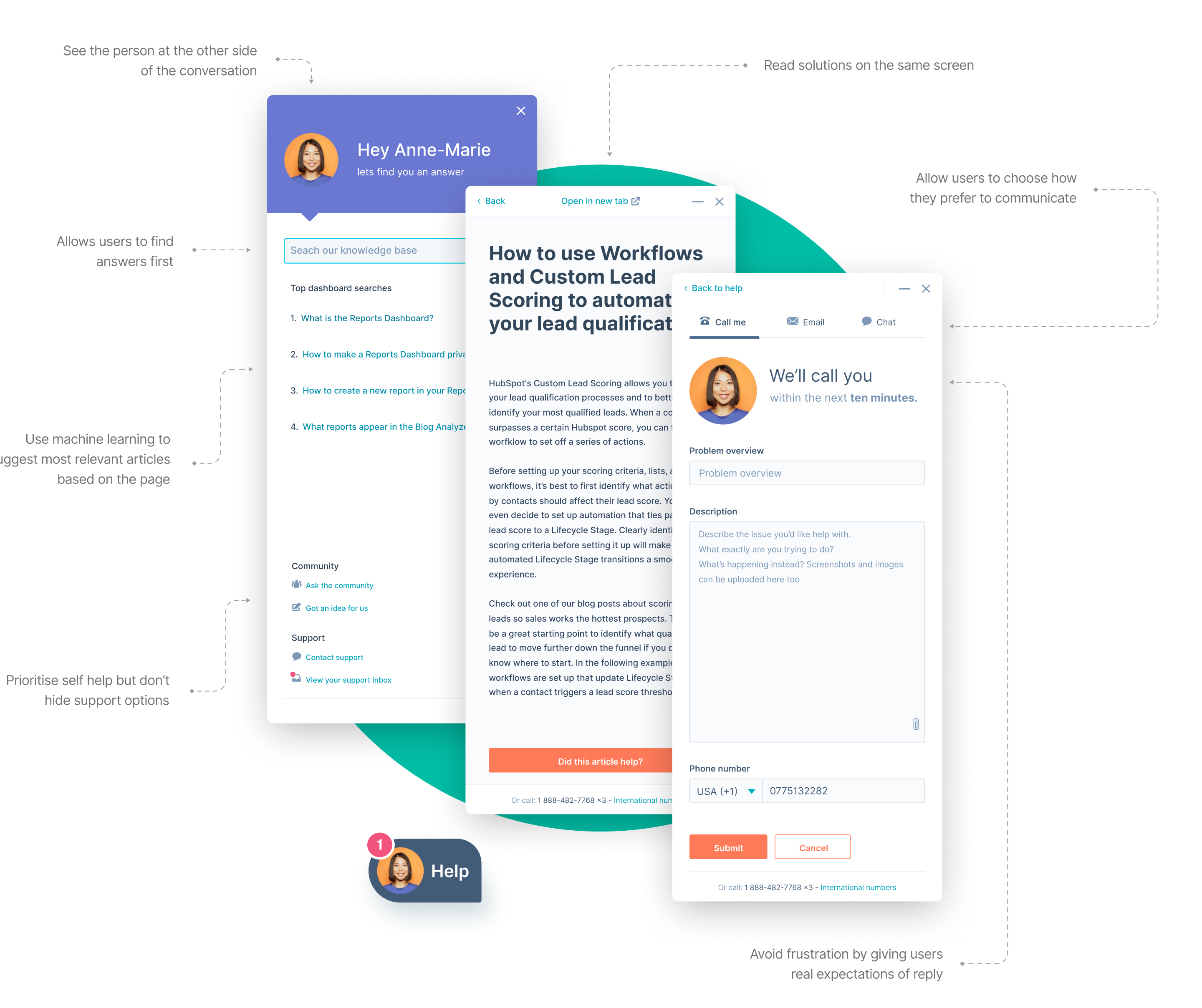
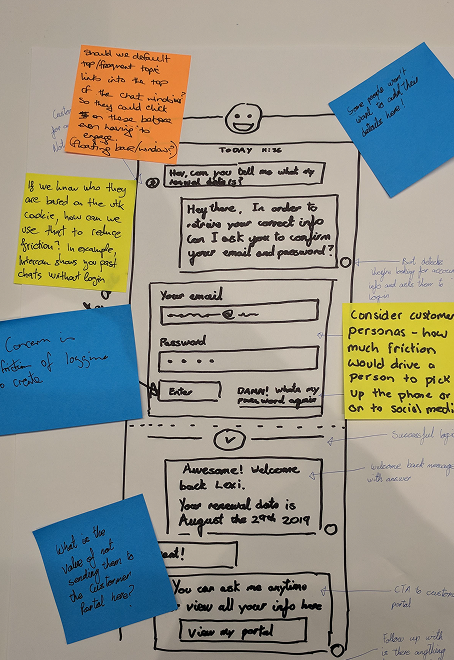
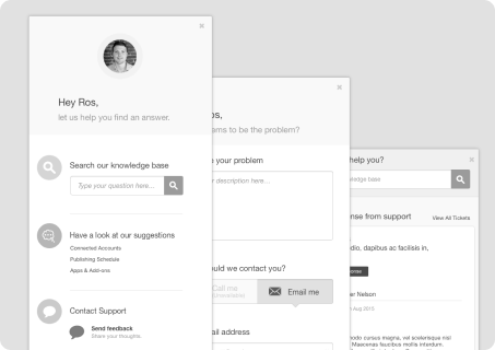
Floating help widget
The customer-facing side of the system: an always-available support widget embedded directly in the HubSpot product. This was before the floating help button became a standard pattern across SaaS. At the time the design decisions it required were not obvious.
It needed to stay available without getting in the way. It needed to draw attention when support had responded. It needed to encourage self-service first without making direct contact feel buried. And it needed to feel consistent with the quality of the HubSpot support team: human, helpful, trustworthy.
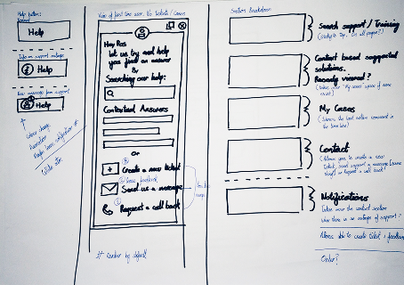
I surfaced Knowledge Base and Academy content contextually, based on where the customer was in the product and what others typically needed help with in the same location. When customers chose to contact support directly, they saw the face of the rep they were speaking with, could choose their preferred channel, and got clear expectations for response time. A photo, a choice, and an honest wait time. No black boxes.
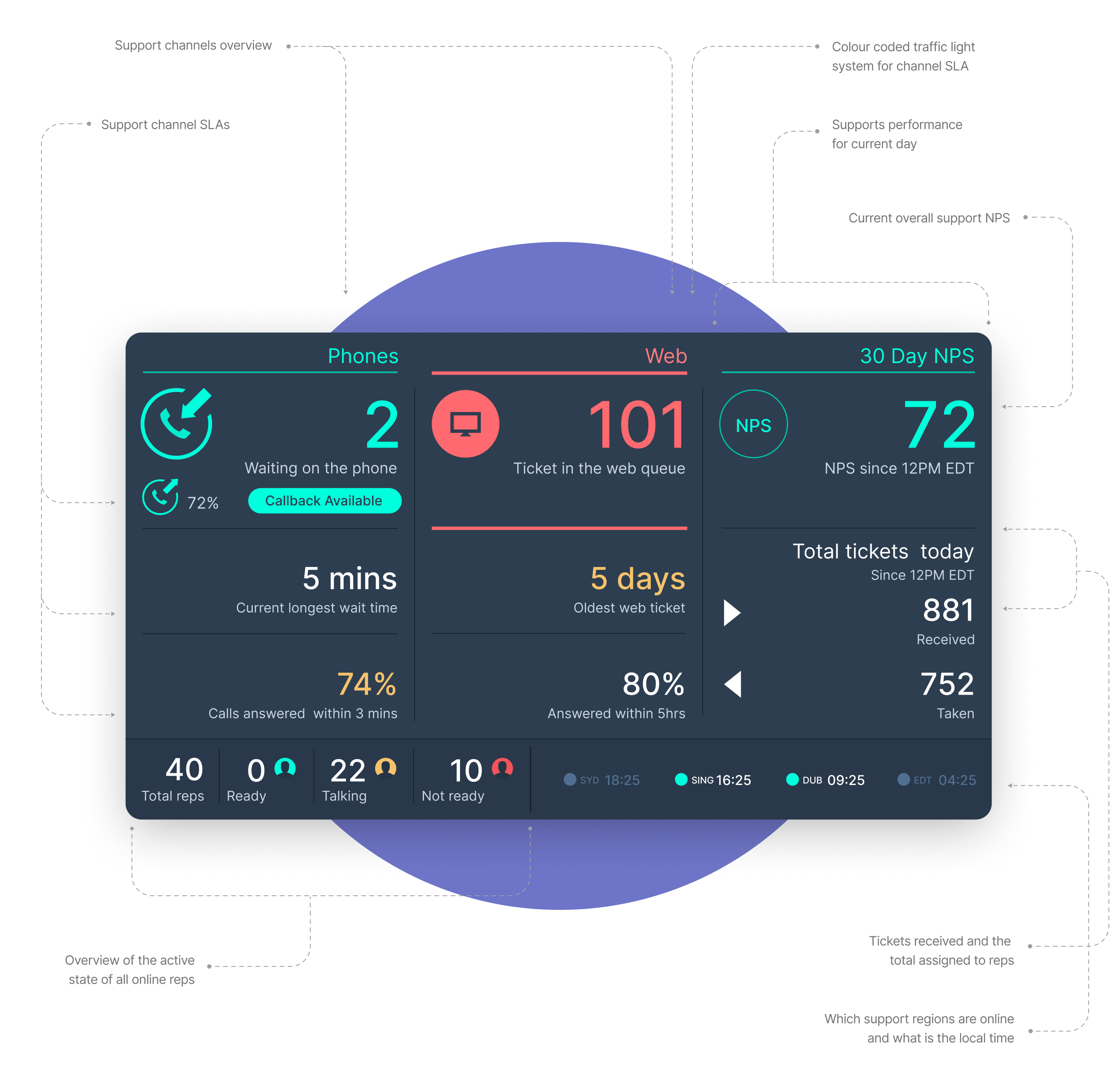
Support wallboard
Large screens in support offices displaying the live state of each channel: queue depth, SLA status, and team activity, in real time.
Reps were highly autonomous. They could shift between channels based on demand without waiting for a manager to reassign them. The wallboard made that self-management possible. I used a traffic-light system tied to SLAs: when things were at risk, colour changes and brief full-screen inversions drew attention without becoming constant noise.
I also built a compact thumbnail version for the inbox, so reps working remotely or between tasks could check the state of the floor without looking up at a screen.
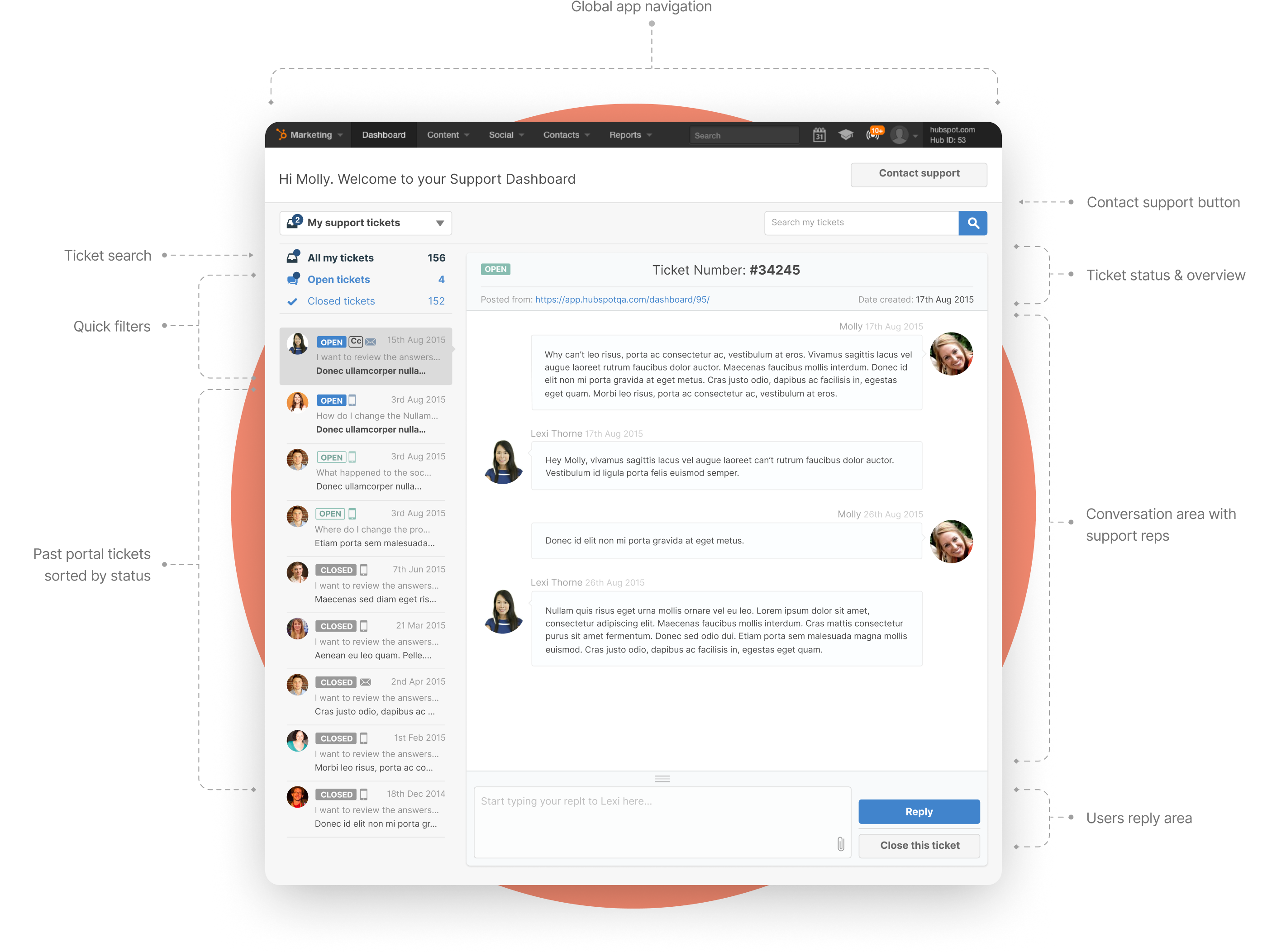
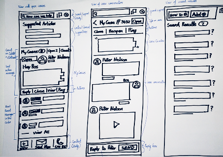
Customer inbox
Smaller in scope, but it solved a specific pain point clearly.
Customers ran into the same issues repeatedly: a problem recurring, a new team member encountering something already solved, someone needing to reference guidance from months ago. That history lived in individual email inboxes, inaccessible to anyone else on the account. When the answer was needed again, they opened a new ticket and started from scratch.
A shared customer inbox gave everyone on an account access to the full support history. If a ticket needed to be reopened, it could be done from the same place, with all prior context intact.
It also created a natural moment to collect NPS scores at ticket close. Participation in surveys that had previously struggled to get responses jumped significantly once the prompt appeared at the right moment, in the right place.
Internal launch
When development began, the focus was consolidation. I replaced six disconnected tools with a single unified system, still integrating key external services like Jira and remote support utilities, but with one consistent interface and a shared data model underneath.
The impact was visible immediately:
- Reps spent less time switching systems and more time resolving issues
- Managers had real visibility into SLAs and bottlenecks for the first time
- Workflows became more predictable across regions
- Global rollout happened quickly because the system reflected how people actually worked
For customers: faster resolutions, fewer dropped threads, and a self-service path that reduced repeat contact.
From internal tool to product line
As the system matured, teams beyond customer support started pushing for similar tooling: product management, account services, customer success. Customers began asking if anything like it was available for them to use with their own users.
Paired with HubSpot’s existing Sales and Marketing Hubs, a service product could give teams a complete view of the customer journey from first contact through to ongoing retention. Without it, customers were either struggling to support their own users or filling the gap with third-party tools that didn’t connect to anything else.
That led to Service Hub. And because the internal tool had come first, the features weren’t guessed at. They came directly from watching what happened when teams finally had the operational headroom to move beyond reactive support and start working on the causes, not just the symptoms.
What Service Hub became
The internal tool work gave a clear view of what support needed to become at scale. When Service Hub launched, its features mapped directly to a progression: from handling volume, to seeing the full picture, to acting on it proactively.
| Capability | What it enables |
|---|---|
| Help desk and ticketing | A unified workspace for managing incoming volume. The operational foundation everything else depends on |
| Customer portal | A shared space for customers to track open issues, access past conversations, and find answers without restarting from scratch each time |
| Knowledge base | Self-service content surfaced contextually, based on where the customer is in the product and what others commonly need at that point |
| NPS, CSAT and CES surveys | Structured feedback collected at the right moments: ticket close, onboarding milestones, renewals. Fed directly back into the CRM |
| Customer health scores | Account health tracked across engagement, usage, and support signals. At-risk accounts surface before customers churn, not after |
| Conversation intelligence | AI analysis of support interactions to identify recurring patterns, coaching opportunities, and early signals of product friction |
| Customer success workspace | A dedicated space for CS teams to manage their book of business, track health across accounts, and prioritise proactive outreach |
| Reporting and SLA management | Team and channel performance visible to managers in real time |
None of these tools work well in isolation. They work because they sit on the same CRM. When a customer completes an NPS survey, a support rep sees it alongside the full ticket history. When a health score drops, the account owner and the support lead see it at the same time. When a knowledge base article resolves a spike of similar queries, that pattern feeds back to the product team.
This project didn’t start as a product launch. It started as an operational problem that was getting harder to ignore. The approach throughout was the same: understand how people actually work, build for that, and trust them to do the rest.